Webpage Components
Documentation | Webpages | Webpage Components
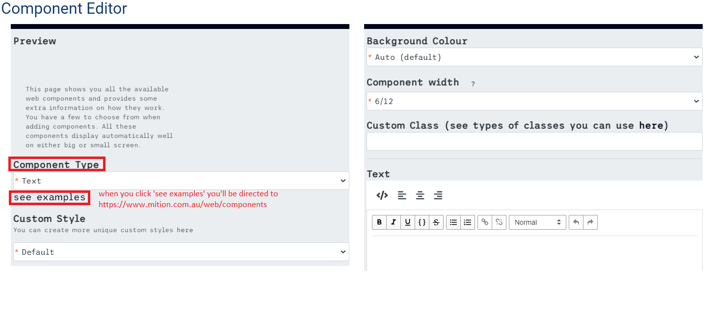
This page shows you all the available web components and provides some extra information on how they work. You have a few to choose from when adding components. All these components display automatically well on either big or small screen.
You can use any of these components by selecting the edit option and filling out the desired styles, then click save.
New Components!
Image Card
This is an image card
Buttons are optional and you can use font awesome icon classes for the buttons too!
Image Card 2
We created this version of the image card too. It also has the option for a button.
Call to Action 2.0
A nicer version of the Call to Action.
This also has an optional button.
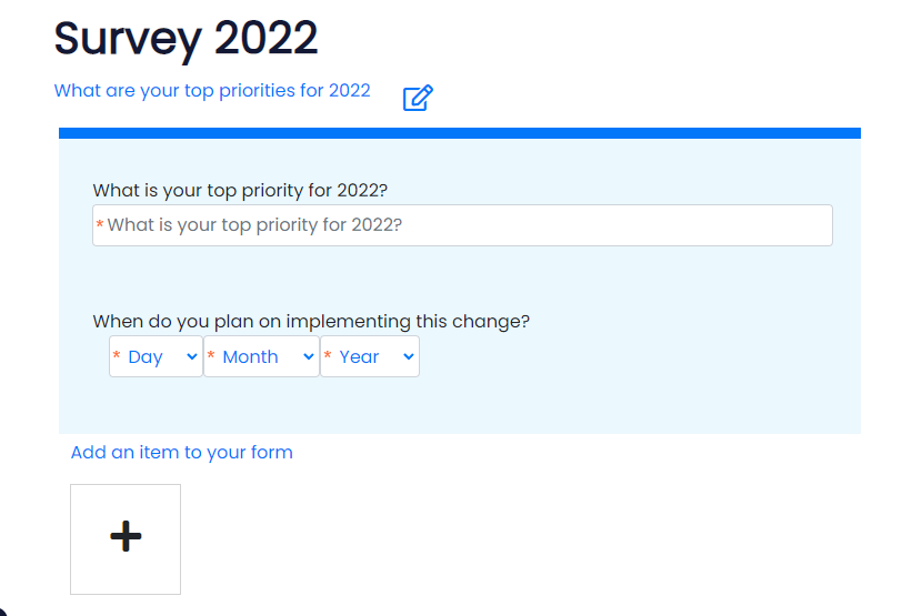
Form
Create forms using the form module, then you can place this form on the website anywhere you want. Because you can control who has access to webpages, you can also control who can submit a form, you can make these open to the public or only available to certain roles.
Accordion
Accordion is a list of headers that can be clicked to reveal or hide associated content. You can click to see more information, or you can put as much or as little information as required in this type of component.
When users click on an accordion to open it. They can see more information. Use multiple accordions for a Frequently Asked Questions page (FAQ) or for tips.
Call to Action
An image on the left or right and and a text area with an optional button.
This is useful if you want an image in the left or right, some text and optionally a button that links to somewhere, including in a new window if required.

Example of Call to Action
Card
Different style cards and different sizes (if you use size 4/12 you can get 3 cards nicely in a row. If you use size 3/12 you can get 4 cards nicely in a row. There’s also a type of card where it has very little text in it. This theme is called ‘light’.
It has a button which is optional and along with styles, this control you can add a pre-built theme which is from bootstrap 4.
Example of Card
Here is some text.
Carousel
It is a component that lets you add any control you see on the page to a carousel, which is a full page scrolling control.
Useful if you would like several heros on a main landing page.
Contact Us
The Contact Us form allows visitors of the page to start interaction by inputting their name, email address, a phone number, and their message. It is one of the best ways to start building a relationship with your website audience.
An email with the contacts details and question is sent to the site administrator, these contacts are not automatically added to the member database. If you want to create users for these contacts to use in a mail campaign you should add each user manually as they arrive.
The "I'm not a robot" prevents spambots from filling your email inbox with fake contact requests.
Contact us
Countdown
This is a countdown to a date with your own countdown timer to a specific date.
Disclaimer
It states the limits of your liability for the use of your website and the information it contains. If you want to ensure that your legal concerns are addressed, it is important that you put a disclaimer.
Disclaimer: This is not a medical site. * enter the disclaimer information here *
Discussion
A widget that if you put on any page, people who are logged in will be able to see it and they can add to the conversation.
This is a social media control which allows users to discuss, like, add images / photos and documents to any page. Users can also flag inappropriate comments. You can subscribe to a discussion to get emails when users add content.
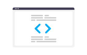
Display Code
The purpose of this is to show on a webpage, if you want to provide coding examples you can use this control so the code is easier to read.
public function helloworld(){
alert('hello world');
}Footer
It is a section or area at the very bottom of a webpage containing important information. It is useful for including material that you want to appear on every web page.
If you put the footer at the bottom of the main home page (\) then you can use this on other pages too, in the other pages settings click the "use default home page footer" checkbox and this footer from the home page will be used. It means you only have to update the footer in one location.
You can create a different footer manually for other pages if you prefer or have no footer.
Header
A header appears at the top of every page and is the first thing that visitors see when they visit the site. It contains common information about the site, such as site logo, site navigation and main contact information.
Example of header
* write information here *
This is a web component that consists of big banners that can link off to a page. You can have text in the text area or just provide a title for it.
Hero 2.0
This is a same component type like Hero but with more editing tools like background video, html text, link URL, button text, mobile background image and such.
Pro Tip:
End the text in the field Description (optional) with two full stops .. and the component will do a typing effect.


Hero 2.0
Icon card
You can use a Font Awesome Icon that you can add to the top or members itself uses Font Awesome for every icon that they see on the dashboard and in the menu.
Image
An image is a visual representation of something. You can insert image and size it from 1/12 to 12/12 or full screen, whichever you like.

JavaScript
JavaScript is a scripting language that can add dynamics and special effects to the site. You can add custom JavaScript by using third-party tools like Google search or animations to pages, form or anything else that you want to add to the system.
This component has a HTML section and a Javascript section, both are optional. You can use the two to embed features from other sites such as forms and embed controls.
Page List
A page list is a simple ordered list of pages on the site. It matches a URL pattern and displays all the pages and any pages that matches meta information (title, description, and teaser image in a list). You can resize the boxes that are displayed too.
Creating a Web Page
Webpages are a great way to provide information to your members, staff and anyone else. With the ability to quickly create a webpage, add some text to it and save it so everyone can see it, it is the fastest way to keep everyone informed. The website...
Name and URL
Create the name of the Webpage by clicking the edit icon and filling out the empty box with the appropriate name that you want. . For the URL, it has to have a forward slash ( /) and has to have a name. It’s not recommended to adjust the homepage t...
Including a webpage in Main Menu
If you want to include the new webpage in the main navigation which is located at the top area, just click settings and the option ‘include in main navigation’. The main menu is a list of the most used things for quick and easy access. You can add ic...
Website Main Navigation Menu
If your top menu getting too busy? here is how to change into a double layered menu. The ‘double menu feature’. To set up a double menu there are a few steps to follow, you will require Administrator level access to perform this change:Step 1. · Go t...
Setting Security (Roles)
Web pages can add security. You can create pages and areas that are limited to people who are part of a specific role. You can include more than 1 role and all those roles will have access. You can create your own roles (see Admin Settings > Members ...
Enabling or Disabling a Page
You can build a page and have it enabled or disabled until you’ve finished making or adding content. If the page is enabled, it has a green light. You can turn pages on and off easily by just clicking on the ‘enabled’ option or not clicking on it. ...
Using the Main Footer
The Footer, is a section or area at the very bottom of a webpage. It contains important information and is useful for including material that you want to appear on every web page. The default footer for other pages will show you the actual footer tha...
Animations and Layout (CSS)
Every component you add to a website has a field called Custom Class. You can use this to do a range of inbuild animations and spacing. Underlying Mition is Bootstrap 4, a powerful browser based layout system. So all the Bootstrap 4 features are av...
Moving Webpage Components (Drag and Drop)
You can move the webpage components to a different location within the page using the drag and drop option. First, move the pointer to the object, then press and hold down the button on the mouse to grab the object. Drag it to the desired location by...
Enabling or Disabling a Web Component
The function of enabling and disabling a web component lets you choose what particular information you want to show to your audience at the given time. You can enable and disable a web component by clicking the options button. The green button then b...
PageNextPrevious
This is a web component that shows the next page in order or in a series.
It shows the page teaser (if provided) and the title and description and a link to the page.
Url : Set the url to find the pages to display.
Size : You can adjust the size of the preview in bootstrap sizes 1 to 12.
Depth : You can optionally set the depth for the number of childpages/folders, if blank this defaults to 100. e.g. Set url to \ and depth to 0 to show the top level pages like a menu.
PDF Viewer
A viewer that displays PDF files on the site. PDF file format is used when you need to save files which cannot be altered but still need to be easily accessed.
Registration Form
This is used to sign up customers for subscriptions, services, or other programs or plans.
You can put a registration form where it suits you.
You can add custom fields to your members database (see Custom User Fields in Documentation) and they will appear here if you elect them to, you can also make them mandatory.
Registration
Share
These social media share buttons is the share control that lets the user share the current page on a social medium. If you have social media things set up on the homepage’s footer, it will automatically create the share icons for you for that platform.
Subscription
This shows all the prices for each subscription or term that are published and active, or creates a list of your subscriptions and payment amounts that are visible on your site.
Standard
Free Trial
AU $0.00
per month (ex GST)
Business
Business Package
AU $1,199.00
per month (ex GST)
Business
Business Package + Apps
AU $1,399.00
per month (ex GST)
Corporate
Corporate Pricing
AU $2,499.00
per month (ex GST)
It is a big textbox where you can put content in. You can use large text, medium text, or small text. You can also add code or change the text to bold or italics and create links.
Example of Text
Here you can use a textbox control to put any text in.
User Directory
Directories are a list of people that have specific role. Put this on a page and make it accessible to various members so they can have social interactions with each other, or you can put a list of all the different people that have a specific role and lock the page down so that only people in that role have it. This is a good way of letting staff or trainees find each other.


Video
A component where you can add videos to the site or to the dashboard, media library, document, or a secure document library. Just upload the video and enter the display name, keywords, description or a short explanation of what the file is. You can upload video or use a YouTube link, or your own custom embed code (Vimeo, etc.)
YouTube videos: When you upload a YouTube video to your account, the share link looks something like this https://youtu.be/kjRrIr4SFPc - paste the URL for your video into the URL field and select YouTube and that is it. The Youtube screen is best viewed at size 6 or 12 and will auto scale for any device size.
Bootstrap padding and offset
Bootstrap is used to modify the appearance of the element in a web site. There is a field called custom CSS where you can add different bootstrap padding and animations. You can also custom class to each component. This allows you to add bootstrap classes such as these:
mi-auto
margin left auto
mr-auto
margin right auto use this with the above one to centre a box in the screen
offset-md-2
This will offset the container, so you don’t have to put a filler box before it. This one is a size 2 – replace 2 with any value between 1 and 11.
(Note: you can use more than one custom class on the component)
Size (bootstrap sizing)
You can size these components to be full screen which we call size 12. With bootstrap sizing, you adhere to the 12-column system which means everything is broken up into 12.
Example: You want to have things that are size 2, so you’ll have 6 of them. We could have things with a size 6 and have 2 of them. We can size every one of these components differently.